Wednesday, June 13, 2007
Visitors Update
Since addding a counter/ sitemeter a couple of weeks ago i have noticed a few things on both blogger and flickr. On blogger i have had a total of 37 visitors to by blog with an average of 17 page views that stay for an average of 8:20 minutes. Of those visitors 1/3 have been referred by ba-ma metablog, 1/3 by google searches and a 1/3 by navigation bars on other blogs. I have had interest from countries such as Lativa, Iran, South Africa, Untied States and Austria. My counter currently reads 223 and their is no indication of favourite pages within my blog (i guess visitors would read posts from the main page and not click on the post to open it on a new page).
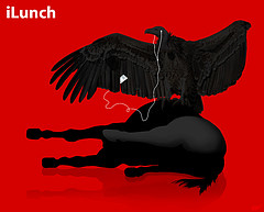
Within flickr i have been aware the importance content has on influencing views of images. The most popular image being viewed is Cyanide and Happiness with 507 views. This figure is significant because it has only been up for about 2 weeks whereas one of the very first images uploaded on my account, iLunch has had only 3 views. I am one not to be influenced my ratings, but it shows the impact one can have.
Tuesday, June 12, 2007
Assessment#2 blog post
Flickr
- has uploaded more than the minimum pictures
- I have organised pictures into sets and pools (house warming party, design and monograms)
- uploaded screenshots of examples of good and bad aesthetics in websites
- all pictures have titles and descriptions
- pictures of interest to other students have MPI104-2007 tag
- pictures of no interest to students do not have MPI104-2007 tag
- all pictures have tags other than MPI104-2007 tag
- I have pushed over the minimum pictures to MPI104-2007 group
- I have over 12 contacts, joined over 3 groups and nominated over 6 favourites
I have tried to upload images that are not too personal and relate to art, design and other interesting stuff. I have used Flickr to look for resource design material. I feel it's interestingness comes from it's ability to relate to other students interests.
Del.icio.us
- I have saved over the minimum number of pages of bookmarks
- all bookmarks have descriptions
- all bookmarks have tags
- has bundled all tags (except for: tags)
- all bookmarks of interest to students have MPI104-2007 tag
- bookmarks of no interest to students do not have MPI104-2007 tag
- have several different del.icio.us users on my network
- have saved links for others
Most of my bookmarks are related to design, although their are more personal tags relating to golf and sport. Del.icio.us has been a tool that has been intergrated into my workflow. It has enabled me to save resources used for university, my regular bookmarks and new bookmarks found through my network. Aesthetically speaking del.icio.us is a well structed website, it's interestingness comes from it's content ( in it's ability to bookmark personal interests + other people with the same interests).
Blog
- without knowing the minimum number of post i feel i have posted on a regular bases
- all posts have working links
- have experimented with templates, fonts and colours
- have included a RSS feed of my del.icio.us bookmarks
- have a technorati "fave this blog" button
- have nominated ba-ma metablog as a favourite on technorati
- have a counter
- included a blog post about visitors
I now know the amount of work that goes in to maintaining a blog. The aesthetics process for me as a graphics student is a good way to change an online environment rather than dealing with just print material. I have corrected some spelling mistakes in earlier posts to improve the legibility of my blog. The content on my blog deals with my interests in design, golf and other interesting sites found during this semester. I have tried to create a subdued, minimal blog where no two colours clash and there are only the necessary elements on the page, a process that took a serious length of time.
Saturday, June 9, 2007
GRP224 Assess. No.2 Reading Reflection/ Learning Journal
Reading No.7 'Lovemarks'
- what makes some brands inspirational, while others struggle? Lovemarks deliver beyond your expectations of great performance, reach your heart as well as your mind. We get attached to them.
- think they reach your mind first and become a lovemark
- you have to have respect in a lovemark
- three most influencial places to find a lovemark are on screen, online and in store
- on screen, creating that emotional connection
- online, the loyalty to a brand goes beyond reason, consumers have the ability to interact and respond to their product through forums, brand loyalty, membership, etc
- in store, all the senses are motivated, maybe why 80% of decisions are made in store and 50% of brand switches happen in store
- in a technologically motivated world, you would think it is easy to keep loyal customers, to see you as the only solution to their problem
- it’s easy to come up with a well thought out, spaced, creative, visually appealing brand, the hard part is making it attractive to customers
I looked at logos from good logos top 250 logos. It's a website that develops case studies into the design of particular logos. I also took inspiration from 'Business Cards, The Art of Saying Hello'. A book by Micheal Dorrian and Liz Farrelly that displays the business cards of over 250 graphic designers and agencies. Here are also a couple of logo that i used in the initial stages that i used as a starting point for my first designs.
For the 2nd assignment, i have hopefully fixed some simple problems that were clearly evident in the 1st assignment. Thoughout the working process for Rings of Saturn i was constantly telling myself "how what im designing now can transfer into other circumstances". Eg/ how well the logo will work in the business card or letterhead. I think as a consequence to having a coherent design, you can be limited in your creative process and outcome.
In terms of design i tried to not over emphasize the 'sci-fi' aspect of the company as well as keeping in mind the name of the company is Rings of Saturn, so i didn't try and ignore that. For me im pleased with the outcome, all aspects of the identity relate to one another (making an identity). From a consumer's point of view each aspect of the identiy would be seen individually and not all at once, so they would make the connection to the company from seeing similar aspects from, for example, the business card and letterhead. What im trying to say is that i understand why we as designers have to make that connection between different aspects of a corporate identity.
Wednesday, June 6, 2007
US Open Pairings
The pairings for the U.S. Open are out. Someone seems to have put together some interesting threesomes.
1. Masters replay: Tiger Woods, Chris DiMarco, Luke Donald
2. I'm Not a One-Hit Wonder: Rich Beem, Ben Curtis, Shaun Micheel
3. I'm the Best Player over 47: Peter Jacobsen, Jay Haas, Bernhard Langer
4. I'm Not a One-Hit Wonder, either: Bob Tway, Steve Jones, David Duval
5. Major Runner-up is not bad: Thomas Levet, Len Mattiace, Rod Pampling
Check out the US Open pairing here
Wednesday, May 30, 2007
Keeping on Track of Visitors
I am currently using a free counter provided by easy hit counters. It was a simple decision, as it provided the code necassary for it to be visible on my sidebar. The counter currently reads 105, which was only put up about a days ago.
On my Site Meter Account, remembering it was only activated today, it has a grand total of two visits (both being referrals) with a total of 4 page views, from United States and Australia.
On my del.icio.us account i currently have 16 fans. Other than that i cant tell you much about the amount of people that have accessed my account.
Friday, May 25, 2007
Thursday, May 24, 2007
Technorati
The basic idea is that Technorati is a tag based index of the blogosphere (blogs and blog media) that allows you to do tag based searches of topics you are looking for.Here's a really good link that tells you how Technorati can be intergrated into your blog/ workflow.
My ranking ( being the number of positions you are away from the number 1 ranking blog) on Technorati is currently at 2,102,322 and have an authority (being the number of blogs linking to my website) of 1.Here's a great interview with the founder and CEO of Technorati that explains what Technorati does
Designing a good logo
It’s been said that art does not exist in a vacuum, and we are all influenced by what we have seen. Nowhere is this more true than on the web. So, before I talk about the actual process of designing Godbit, I need to give due credit for where I drew my branding inspiration. When I first started out, I knew I wanted this site to appeal to geeks, a demographic in which I include myself.
If you’re from my generation (or older), you’ll no doubt remember computers such as the Apple II. Cutting edge for their time, these dream machines had only a two-color monitor. Well, it was really more like one color: green, with the rest of the screen black. It was this type retro look I was considering, because I wanted the site to be about getting back to basics, past the snazzy designs and back to the foundations of good machine language: code.
This is also a reoccuring theme in the Matrix, which also drew its inspiration from the old console input of light text on black background. To the younger crowd, I knew the color scheme of Godbit would remind them more of this movie. I really liked the underlying theme of those films: Fighting the status quo. That is something that I also wanted to represent with Godbit, to raise the bar of coding standards beyond where the Church is at today. “We wrestle not against flesh and blood,” but against apathy, bureaucracy and mediocrity.
Read more at sonspring.com
Wednesday, May 16, 2007
Form + Content
The term aesthetics concerns our senses and our responses to an object. If something is aesthetically pleasing to you, it is pleasurable. Whatever the actual object in question, those studying aesthetics seek to understand why some things arouse positive reactions whereas others arouse negative ones. Why are we drawn to certain objects and repelled by others? The very question of how and why aesthetic experiences are created is itself also a subject of aesthetics
Form + Content mainly are to do with our visionary senses being; colour, shape, pattern, line, texture visual weight, balance, scale and a sense of movement.
A website that i feel has good aesthetics being a graphic designer is the designers republic. Mainly a typographical website that allows your to expolre the content and not merely read whats on the page. It has aspects of simplicity, minimalism (large forms), yet follows a simple structure and modern colour scheme. It's hard to grasp the simplicity so have a look at it.
On the other hand, changing minds is a blog/ website that i beleive to have bad aesthetics. As blog about bad website design, it has large areas of white space with text (a sensory overload) too much in my opinion. A website has the possibility to create unlimited number of pages, something changing minds fails to do. In it's defence though, it's an informative website and thats simply where it stops, but there is always the question of form vs. content?
With the aesthetics of my own blog, i have changed templates 5 or 6 times trying to find the balance between the elements i have added on page and the layout of the original templates. I settled with 'rounders' for it's legability between posts and sidebar (being a clear distinction). I decided to use subdued colours where no colour dominantes over another. For me they feel more fixed to the screen than white on black or brighter colours. In terms of typography, i have intentionally made limited differences between heading, post, date, sidebar, etc. There are subtle changes in the tone where dominent aspects are in a darker tone.
Websites i feel a good connection between aesthetics and content are taged under aesthetics in my flickr account with a description of why. My favourite being tree hugger. It shows a real connection between the content, layout and chosen colours.
Wednesday, May 9, 2007
RSS and XML
RSS (rich site summary) is a family of web feed formats used to publish frequently updated digital content, for example a blog. It allows you to stay easily informed on the latest content on the sites you are interested in, and in the process save time.
RSS solves a problem for people who regularly use the web. It allows you to easily stay informed by retrieving the latest content from the sites you are interested in. You save time by not needing to visit each site individually. You ensure your privacy, by not needing to join each site's email newsletter
XML stands for Extensible Markup Language and is a markup language for documents containing structured information. It was designed to subscribe data. It was created to structure, store and send information.
Structured information contains both content (words, pictures, etc.) and some indication of what role that content plays (for example, content in a section heading has a different meaning from content in a footnote, which means something different than content in a figure caption or content in a database table, etc.). Almost all documents have some structure. XML was created so that richly structured documents could be used over the web. The only viable alternatives, HTML and SGML, are not practical for this purpose.
I decided to go with google reader on the recommedation by our lecturer, i also considered that we have a google gmail account where the reader is intergrated into your entire google account.
Wednesday, May 2, 2007
MPI104-2007 Assessment No.1 Post
Blogger
I have found the blogging process very interesting. I hated talking about myself so posting links to interesting websites was how I made it exciting. So far I have 15 posts. I tried to create a bold, minimal, eye catching blog, achieved through strong colours and by limiting the number of fonts used.
- I have multiple links in my sidebar
- I currently have 15 posts
- Most of my posts have links
- I have commented on some other people’s posts
- I have updated a profile
- I have tried many times to upload a picture to my profile unsuccessfully
- I have experimented with different templates
- I have experimented with fonts
- I have experimented a lot with colours ( high contrast)
- Some of my posts contain pictures
- All my posts have titles
- I have a description of my blog
- I have added a video bar, links bar
- I have posted a link to my Technorati
- Have tried to had a counter unsuccessfully
Del.icio.us
I tried to make my del.icio.us account interesting to me. For me to use the site it had to contain all the bookmarks I use on a regular basis, knowing I could access them anywhere. It’s also been a good way of networking websites between different users. Found this the most rewarding out of the three.
- I have saved around 70 bookmarks at this stage
- I have progressively saved more bookmarks
- Del.icio.us is an intergral part of my workflow
- Most bookmarks have descriptions
- Bookmarks have tags
- I have bundled tags
- I have subscribed to tags
-All appropriate bookmarks have MPI104-2007 tag
- I have joined a network
- I had problems trying to save links for others
- I have bookmarked my flickr home page
- I have bookmarked my blog homepage
- I have a del.icio.us post on my blog
- I have posted a working link to my del.icio.us post on the metablog
- Have currently do not know how to create a link roll on my blog
Flickr
I would not like to think I uploaded images onto flickr because I wanted to impress other users. I see it as a great way to store images online and meet other users with similar interests. I have used the tags: banksy, brody, design, family, golf, holiday, monogram, mpi1042007, party, photography, roaming, textures and tuncurry. I have been uploading pictures that properly reflect the state of mind I am in at the moment. Graphic Design is at the forefront, things that catch my eye (textures, monograms) and could be used at a later date. Also there are some more personal family and friend’s pictures. I have discovered an amazing Digital Manipulation Group, well worth a look.pixtricks
- I have uploaded about 80 photoes at this stage
- I have progressively uploaded more pictures
- All pictures have titles
- Some pictures have descriptions
- Some pictures have MIP104-2007 tag
- Pictures have tags other than MPI104-2007
- I have joined MPI104-2007 group
- I have pushed pictures to MPI104-2007 group
- I have contacts
- I have joined other groups
- I have nominated favourites
- I have commented on other user’s pictures
- I have a flickr profile
- I have flickr post on my blog
- I have posted working link to flickr post on metablog
Tuesday, May 1, 2007
Monday, April 30, 2007
Funky Souls
A useful free music download site. Although it is in Russian, once your a member and get the hang of navigating through the website, to the desired links, you can find some albums that are released months ahead. Check it out!!
funkysouls
funkysouls
Anzac day activities
Sunday, April 29, 2007
Monday, April 2, 2007
grp224 Reading Reflection Week 7
Lovemarks
- what makes some brands inspirational, while others struggle?
- lovemark – deliver beyond your expectations of great performance, reach your heart as well as your mind, we get attached to them
- think they reach your mind first and become a lovemark
- you have to have respect in a lovemark
- three three most influencial places to find a lovemark are on screen, online and in store
- on screen, creating that emotional connection
- online, the loyalty to a brand goes beyond reason, consumers have the ability to interact and respond to their product through forums, brand loyalty, membership, etc
- in store, all the senses are motivated, maybe why 80% of decisions are made in store and 50% of brand switches happen in store
- in a technologically motivated world, you would think it is easy to keep loyal customers, to see you as the only solution to their problem
- it’s easy to come up with a well thought out, spaced, creative, visually appealing brand, the hard part is making it attractive to customers
grp224 Reading Reflection Week 5
‘Text’ Column
- the organization of letters on a page, the most basic design principle but one of the hardest to effectively achieve
- what type of font, how big, alignment, spacing, order, shaped and manipulation
- these principles can be divided into three sections;
- letter, text and grid
- the importance of typography is underrated, and as a designer the importance of which has to be at the forefront of our minds
- something that I am only beginning to understand and construct/ understand in my mind
grp224 Reading Reflection Week 4
Revenge of the Brand
- What is branding? A logo or a trademark
- That thing you burn into cows is the answer. Rob Frankel is making the point that a brand has to differentiate itself so that prospective buyers don’t miss it
- Branding is not about getting your targets to choose you over your competition. Branding is about getting your prospects to see you as the only solution to their problem
- Branding is not about you. Branding is about them
- If the branding is wrong everything else is too
- Good brand vs. bad brand:
- delievers the message clearly, deliver the message clearly is the start of ta good brand
- communicates quickly, gets the message of the brand across quickly
- projects credibility
- strikes an emotional chord, technology + product, everyone has a connection with one or the other, it’s about the brands problems and the brands solution
- motivates the responent, motivates the responent to cross the line and buy their product
- creates a strong user loyalty, best brands are a mix of differentiation and compelling personality
- Advertising grabs their minds, branding gets their hearts
grp224 Reading Reflection Week 3
Reading Week 3
Pittsburgh Children’s Museum
- to suit the corporate identity of the museum designers created two logo’s with variations on them.
- intending to unite parents and children and the interactivity of the museum
- created variations on the logo to suit different situations (eg. Playground, lounge for parents)
- trademark rather than a logo, I think reflects the personality of the museum, adding a typeface would make it look to corporate
Metreon – A Sony Entertainment Centre
- global and local culture
- place to catch a movie, eat, play, shop, learn and spend time
- unique concept
- just shows how design is a ongoing, ever-changing process and the interaction the designer has with the client
- the client has the final say
- not necessarily a negative process, as a designer you work to a set criteria that you have to meet.
grp224 Reading Reflection Week 2
Reading Week 2 (Logo)
- a logo is a combination of a graphical element and it’s logotype ( typeface)
- should cause immediate recognition by the viewer
- is only one aspect of a brand or company
- iconic symbol
Aspects of a logo:
- logotype: text or abbreviated text
- icon: symbol/ brandmark
- Slogan?: description of the company
Effectiveness of a logo:
- should be unique
- functional and be the ability to be used in many different contents
- effective even under different sizing
- work in b/w, full colour, spot colour, halftone
- design principles
- one of the more important: represents the company
When designing:
- don’t go over the top
- use fewer colours
- avoid gradients
- alternatives in varying contexts
Reading Week 2 (Corporate identity)
- corporate identity: ‘persona’ of a corporation in accordance with it’s business objectives, usually by the use of branding and trademarks, generally amounting to a logo
Composed of 3 parts:
- Corporate design
- Corporate communication
- Corporate behaviour
Corporate visual identity consists of:
- provides an organization with visibility and recognisability
- symbolises an organization for external stakeholders, hence contributing to it’s image and reputation
- expresses the structure of an organization to it’s external stakeholders
- internal function of corporate visual identity, employees identification with the organization as a whole and specific departments
Wednesday, March 28, 2007
flickr
another exciting new way of sharing your images, bookmarks, etc online, making them easily accessable to you wherever you are. I am beginning to see the relationships that your blog, delicious, and flickr create and how they interact. A new process that for me will take some time to get my head around. Cheers, exciting times.
Friday, March 23, 2007
Wednesday, March 21, 2007
del.cio.us
As a del.cio.us first timmer the ability to access your
bookmarks from wherever you is a very exiting process. Eliminating the need to have access to your own computer. Share + distribute information with others.
Here is my link to my account
bookmarks from wherever you is a very exiting process. Eliminating the need to have access to your own computer. Share + distribute information with others.
Here is my link to my account
Monday, March 19, 2007
Future Reality
Another site I stubbled across!!!
It deals with recent and future advancements in the
creative industry. They do product reviews, mostly on
hardware + software for the film industry. They also
prodict future technological advancements.
futurereality
It deals with recent and future advancements in the
creative industry. They do product reviews, mostly on
hardware + software for the film industry. They also
prodict future technological advancements.
futurereality
Wednesday, March 14, 2007
The designers Republic
For those fellow students in GRP223
The Designers Republic has done some invitations for Issey Miaki that are quit different to what you might expect!!!
Might be useful for our second assessment
Check it out: thedesignersrepublic
The Designers Republic has done some invitations for Issey Miaki that are quit different to what you might expect!!!
Might be useful for our second assessment
Check it out: thedesignersrepublic
Subscribe to:
Posts (Atom)